
|
For my first design I experimented with the developed whole milk posters. I took the design of the single object in the milk bottle and erased the middle part, I felt like that would be the most effective in the design and allow the carton to have more space.
I kept the same decorative font from all my other designs and developments as it is the most fitting and appeals well in the layout. It's childlike and clear which relates to the target audience. I also added small dots around the middle part to fill up the negative space and give it more texture and colour. |
final design

|
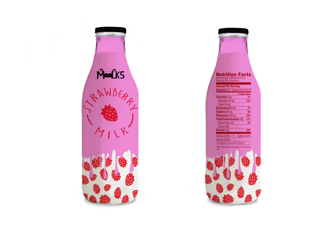
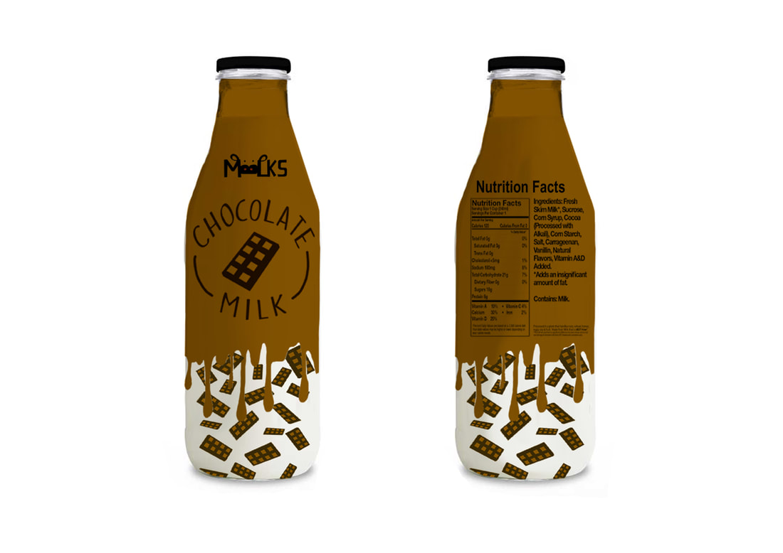
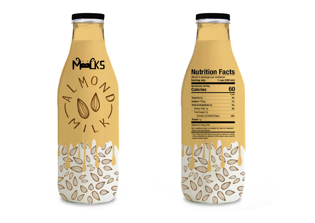
For my final mock-up design I used my simple illustrations as well as my mood board to inspire the design. Overall, I felt like this layout and the look was perfect and was exactly what I wanted to create. I started with designing the liquid layout, I tested out a few designs before I chose the top design as it was much simpler, fitted well and looked more realistic. |


|
I kept the colours realistic to the object therefore the viewer would instantly know what flavour without having to read, they are vibrant and rich which makes them stand out more and very eye catching. I wanted half of the bottle to have the colour and have it appear as liquid dripping down leaving the bottom half completely colourless. I felt like this create a playful and spontaneous style. I placed the small illustrations at the bottom to fill up all the negative space and make the bottle seem more complete, by adding this simple design it became very unique and childlike, which would attract the target audience I was going for. |

With the small details at the bottom I placed them randomly until they fitted well with what I wanted, I rotated them around and changed the different sizes. This made the design come together fill up the space to appear more busier and detailed. I liked how overall they appear to look like they're falling down from the liquid.
|
I wanted to create a traditional glass bottle in the simple style, I really like how these came out and appeal more quirky and childish than the cartons. I experimented with the placing of my logo before keeping it in the centre as well wanted to add the Nutrition Facts on the back.

|
|
|
|
As the Nutrition Facts at the back didn't make the whole bottle feel complete I decided to add more information to the design including the ingredients found inside and any other extra information, by doing this the layout and design of the whole packaging looks more professional. I took information from existing milk products and used them as inspiration when adding the little information and nutrition/vitamin facts.


Final product
To finish of my concept I wanted to create 3D bottles with my designs on them, to make it appear as if they were an actual product you could buy. I originally wanted to have the layout fit the whole plastic bottle however, I didn't have the access to the right materials and shaped bottles to do. I was still able to showcase my designs in a professional way. Instead of wrapping the whole bottle I decided to leave the stop half the colour of the bottle and have the bottle half my wrapping, this was due to not being able to wrap it smoothly around as well as it fitted nicer with the layout of the bottle.


|
I wanted to experiment with different type bottles, including the glass bottles. The layout of the bottles was thick therefore the design looks too stretched out and the bottom of the illustrations are cut off too much.
|
