I experimented with different digital fonts to create the perfect logo for my brand.
|
I messed around with the colours and patterns in the font, using the traditional baby blue colour I tested it within half of the fonts, before trying out the pattern of a cow. I don't think these stand out as much as I wanted or are eye catching enough to grab the buyers attention. |


|

|
I decided to use the two 'O's into the shape of a cow's nose before adding the yes and ears, I like these turned out successful and fit well with my idea. They are fun and playful which would suit the target audience.
|

|
HAYRULLAH YORGANCI
|

|
|

|
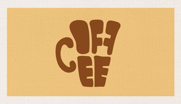
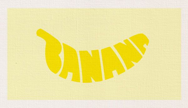
Hayrullash Yorganci is a Turkish graphic designer and illustrator found on Behance. Their work takes ordinary objects and changes them into fun typography. Yorganci uses the shape of the object and manipulates them into words.
They use uppercase, bold fonts which are then twisted and merged into a shape. The colours are realistic and reflect the object the artist is trying to recreate. Taking the pear image Yorganci has created the outline of a pear and incorporated text inside, using up that negative space within the green and leaving a textual white background. The text inside looks like someone had carved the words out as we see the textured background. The font's are very smooth making the image look more clean. |
RESPONSES
I recreated my different milk ingredients into typography just like Yorganci, I kept the concept fun and playful by adding little details from the crumbs of the chocolate bar to the details in the strawberry and almonds. By adding the small details it adds more depth into the flat coloured typography.

|


|
