COCOPPINA

|
Cocoppina cocktail design is very simple and abstract illustrations. There is small splashes of colour that reflect and portray the object, as well as consist of one bold, block colour. They use a variety of different shapes from circles to semi-circles and the colours slightly diagonal outside the single black outline.
The simple illustrations and colours are placed diagonal across the white background with small negative spaces between them, this gives the poster more spacial while keeping a busy, detailed environment as many illustrations have been duplicated to fill up the page. The decorative typography makes the poster more eye-catching and fun, the handwritten font give's the effect of a rich, elegant atmosphere, which also fits with their target audience - young adults. |
|
I really liked the layout and overall look of their other cocktail posters as it visual shows the viewer what's inside through the simple illustrations and typography. Like the other poster they used the same font typography to give that more relaxed feel as well as the same illustrations.
The layout of the poster, having the name of the cocktail at the top and have the viewers eyes then drawn to the bottom really works well and something I will use in my own developments. |

|
RESPONSES


     |
Using the Cocoppina as inspiration for my poster, I first created cartoon versions of the food and placed them in a similar layout as the cocktail one. I varied the sizes of the food designs so I was able to fill up the negative space.
I used my logo and placed in the centre so it stood out and slanted it slightly, giving it a playful style. The text underneath I used is decorative and fun, using two different fonts I think this made the typography entertaining as well as it is clear and easy to read, allowing anyone to understand. |

|
In my developments I added blue dots into the poster to appear as the liquid, I went with the blue as the pastel, light colour fitted well within and made it the poster feel more busier and complete a there was too much space in between the food. |
I developed the idea of my product and created the ingredient poster, just like the cocktail one. I kept with the same typography as my logo to keep that continuity and playful look and typed out different ingredients next to the three main illustrations, I like how these came out as they create a simple but effective poster.


|


|
YOPLAIT WHOLE MILK

|
Yoplait whole milk is based in Canada and aimed towards families. I found this poster from their products and was inspired to experiment using the same layout.
I really like how the poster has depth and has a mixture of styles. Despite there only being imagery and no typography viewers can recognise straight away what it's trying to promote. The flat coloured background is bold and striking, the red pops out behind the white milk bottles and draws the viewer in. In contrast with the flat layered background they added real images of the fruit and flowers, these stand out more than if they were simple cartoon illustrations. |
Responses


   |
I liked the whole layout of the whole milk poster and wanted to keep that idea of the food inside the milk bottle. I experimented with different bold, block colours in the back until I was happy with one colour that fitted the most.
|
|
Instead of the background being one colour I wanted to make the bottles different colours and made the match the object inside.
|
  |
     |
I wanted the food to be the background and have the bottles stand out more, I think these turned out well and give it more depth, making the poster seem more unique. As the posters are more based around imagery I wanted to incorporate text and using the same playful, handwritten font I added the name of the drink into the white milk bottles along with the logo, making it complete as a poster. |
Anchor flavoured milk

|

|
Anchor Flavoured Milk is based in New Zealand and offers a variety of milk based products. I chose this as it's playful, childlike design was something I wanted to try out as well as it isn't a basic milk advertisement, it's unique and interesting. The mix media of illustrations and photography is something that I wanted to try for myself and experiment. The drawn illustration of the of the cow ears and other elements stands out in contrast with the photography which makes the image seem fun and entertaining, targeting more towards children and families. The white circle behind the food makes it stand out more and appear as if it's in the spotlight and showcasing the product off. The colour palette of the advertisement is realistic to the product as well as it is vivid and intense, this makes the poster more eye-catching and striking.
Responses
|
|
I first made the background and create the white shadow to appear like a halo around the strawberry before I brightened and made the fruit pop out more by adding and multiplying layers of white.
Once I was happy with how the strawberry looked I began to draw the ears and tail of a cow, making it appear more like a cartoon and playful. |


|
I really like the way everything came together in the final piece and how the colours all compliment each other. I kept the ear colours and the tail realistic to a cow's colour palette. The piece is very playful and eye-catching to a child, making the whole idea of flavoured milk fun and tasty. I wanted to experiment with a banana slice instead of the others as it was much easier to draw around and look professional. I did the same process on the banana as I did on the strawberry and gave the ears and tail spots, so the audience would recognise straight away it was a cow without having any typography. |
I added text to let the audience know what product was selling and to fill up the negative space. I kept the text black and the font the same for consistency and the bold black stood out in front of the bright, coloured background in the banana poster, however in the strawberry I kept the colours very light due to the background being dark. It made the text pop out and easily read.
I also added a nose onto the banana as it fitted with the design and makes it much more unique and engaging for the audience.
I also added a nose onto the banana as it fitted with the design and makes it much more unique and engaging for the audience.


Simple illustration
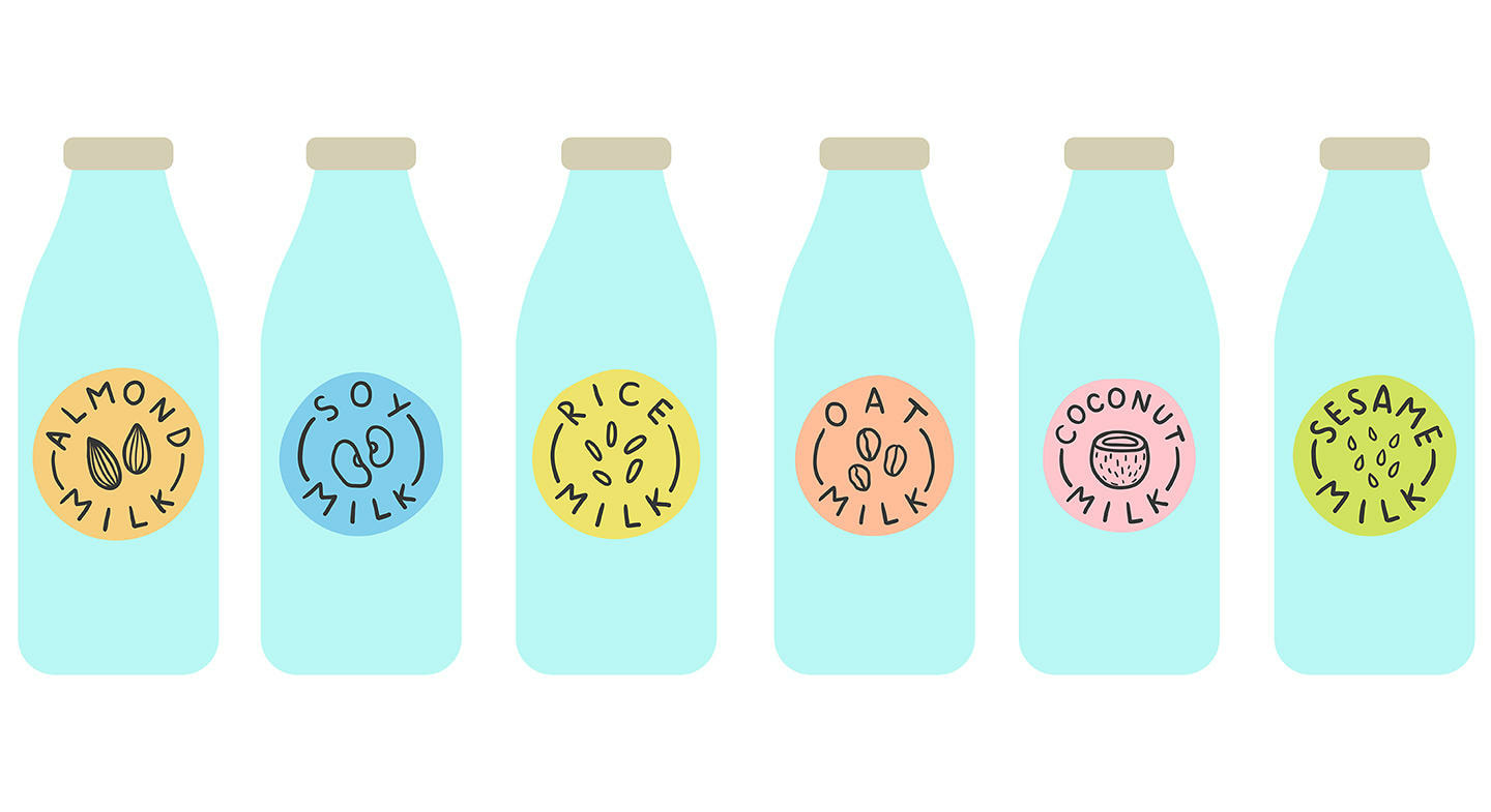
|
This simple illustration I found on Pinterest I found cute and child-like. The typography of the design appears handwritten before than digitally created, I really like how the letters are uppercase and the font is clear, making it suitable for children to understand.
The little design in the middle of the typography easily get across, I liked how transparent the illustrations appeared having the details stand out in front of the coloured background. The use of the circled pastel colours for the background makes the overall layout and design cute and makes it seem much more peaceful and friendly rather than having striking bold colours. |
Responses


|
Using the simple illustrations as my inspiration i created cute icons for the different flavoured milk. I used colours associated with the food and create small illustrations. The text is uppercase and big, making it very clear and legible. I create these completely digital and made the flat coloured, just like the unknown artists. This creates a very fun and childlike atmosphere. I will incorporate these into some milk cartons aimed at my target audience. |
