
|

|

|
|
The typography of the cartoon is very playful and messy, the words appear to have been placed randomly where the buyer would have to read carefully to follow the sentence. Marica's typography are unique as they incorporate song lyrics and other lines spoken by someone else to fit with the product. For example; the sugar cartoon uses the famous song lyrics 'Sugar, Honey, Honey.'
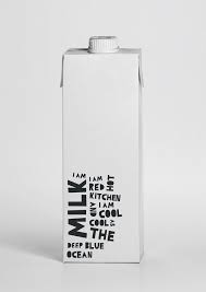
The typography is bold and black, standing out in front of the white carton. The letters are different sizes and in all caps making the package look more interesting. She places the typography at the bottom of the bottle and leaves a lot of negative space, this minimalist design creates a calming and simple atmosphere and having it less complicated and busy makes the product look more appealing. |
RESPONSES
Using Marcia's work as inspiration I used her simple, minimalist layout. Instead of using song lyrics I started with a small poem before using words associated with the type of milk. This made it easier to understand what type of milk it was and advise it towards mothers better.


|
The typography I chose is very similar to Marcia's and keep that childlike, messy style. It's very easy to read and stands out behind the white background. The playful, cut up words is eye catching and interesting.
|

|
I developed the design onto some milk cartons and positioned it to fit nicely on top, the negative space at the top allows the buyer to solely focus on the bottom without any distractions with designs. Showing the most important information. |
DEVELOPMENT


|
I added my own logo in the top middle of the bottle to establish that it's that brand and liked how it all fitted nicely together, the similar typography complemented each other and made the white bottle look more interesting and appealing.
I tried a different layout on the bottle to make it my own, i placed all the typography at the top of the bottle to make it appear as if the words where the liquid and flowing down to the bottom where the logo was. I think this fitted well however, the sentences are hard to follow, making it complicated to read. To make the different titles stand out I added different colours and kept the rest of it black. I liked the idea of having the 'flavoured' milk the colours of the different ingredients and having a splash of colour draws the buyers attention more to the bottle. |
